Before launching several key features of the new Aqua DNA platform, we aimed to ensure a seamless transition from the older version to the new interface developed by my team.
Since Aqua DNA users didn't have access to the new staging platform version, I was given the opportunity to design a walkthrough to facilitate a smooth transition from the old platform to the new one.
What’s the purpose of walkthrough in product design?
In product design, a product walkthrough is a guided, step-by-step tour of a product's interface and features, designed to acquaint users with the product and how it works.
While often used as part of onboarding for new users, product walkthroughs serve multiple purposes in the overall design process. Here are some key roles they play:
User Onboarding
One of the most common uses of product walkthroughs is to help new users become acquainted with a product. By guiding them through essential features and functionalities, you can help users get up to speed more quickly and effectively.
Feature Adoption
Product walkthroughs can also be used to introduce new features or highlight underused functionalities. This can help encourage users to take full advantage of the product's capabilities.
Reduce Cognitive Load
Walkthroughs are designed to break down complex processes into digestible steps, thereby reducing the cognitive load on users. This aids in making the product more user-friendly and approachable.
User Engagement
By providing a walkthrough, you offer a path of least resistance for the user to engage with the product. This immediate interaction can lead to higher levels of user engagement and satisfaction.
Educational Tool
For complex products with extensive features, a walkthrough serves as a quick educational resource that users can refer to. It can replace or complement traditional documentation, tutorials, and FAQs.
Increase User Retention
A well-designed walkthrough can improve user retention rates by making the initial user experience more satisfying and less overwhelming. When users understand how to use a product effectively, they are more likely to continue using it over time.
Research
I conducted quick visual research, looking at various products to see how they designed their walkthroughs.
The design of the walkthrough was mainly influenced by a few companies, specifically Slack, Asana, and Humanity.
It was clear to me that there is a widely-used pattern when designing walkthroughs, which includes the following elements.
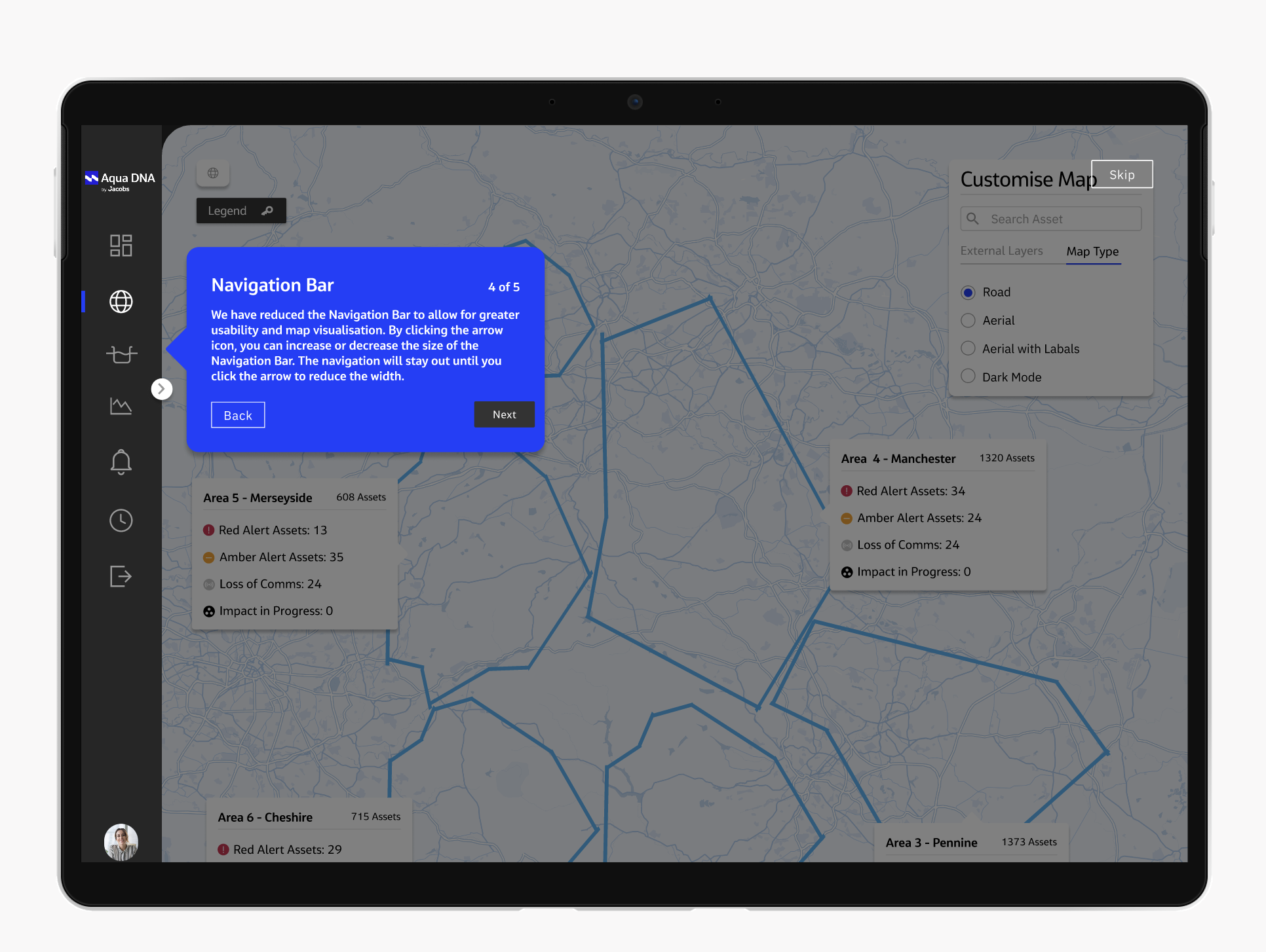
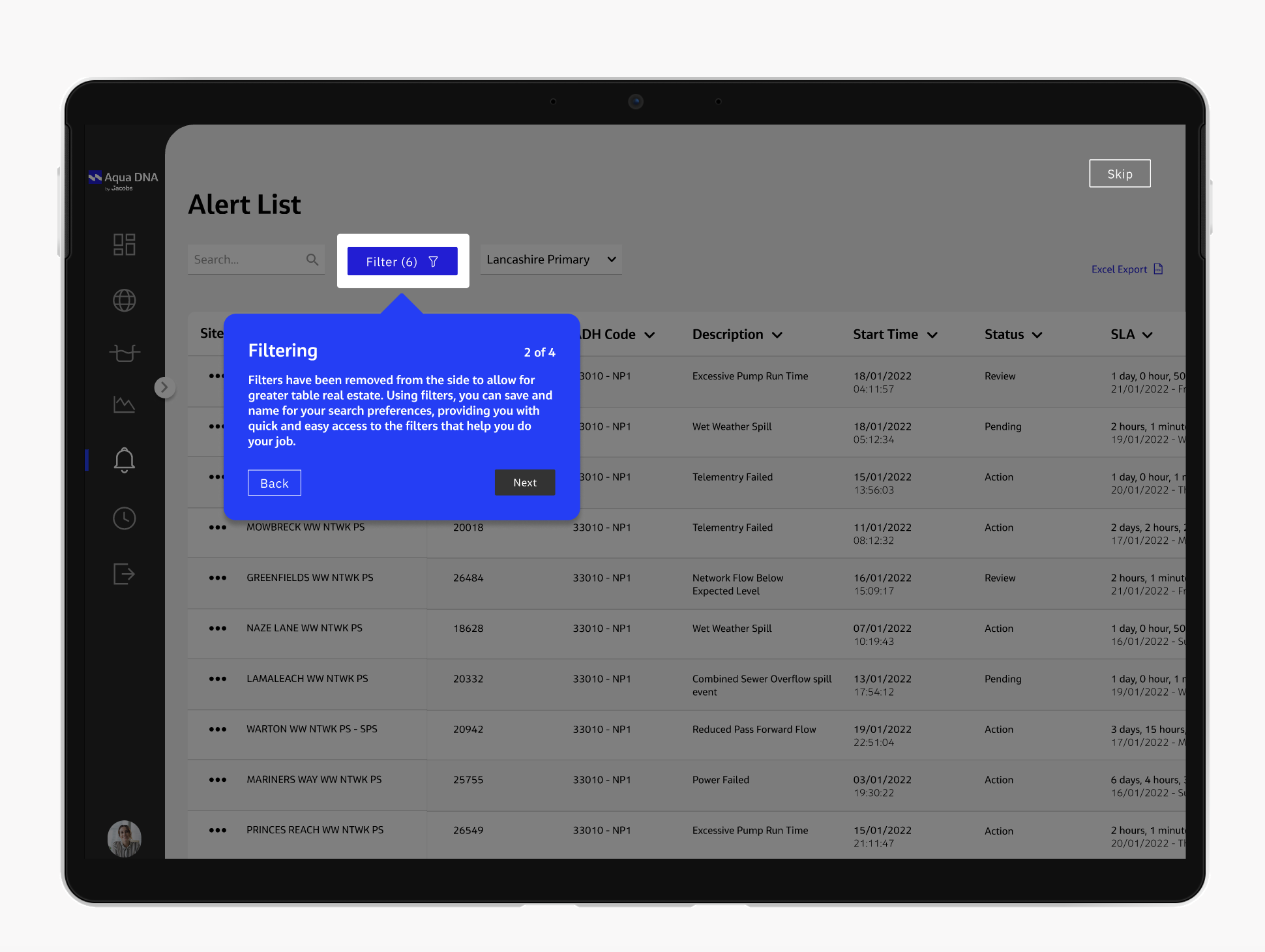
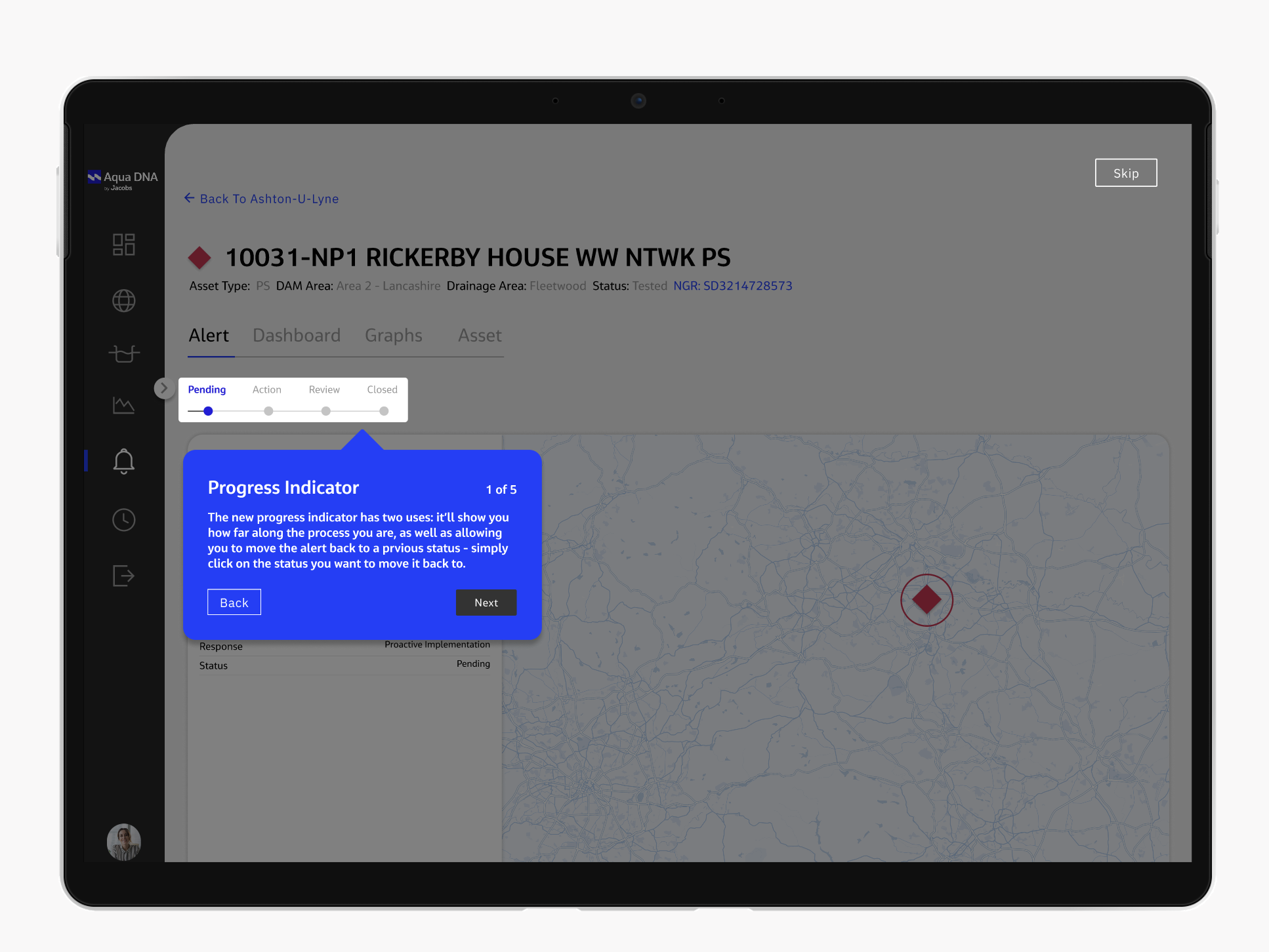
Utilizing tooltips to highlight important information and guide user attention.
Implementing a dark overlay to enhance visual focus during the walkthrough.
Featuring buttons to lead users seamlessly from one step to the next.
Including a progress bar to provide real-time updates on completion status.
Use step indicators, such as "1/4," to inform users about the remaining steps in the process.
Offering a "Previous" button, allowing users the flexibility to revisit earlier steps.
Congratulatory message to signify successful completion of the walkthrough.
What happened next?
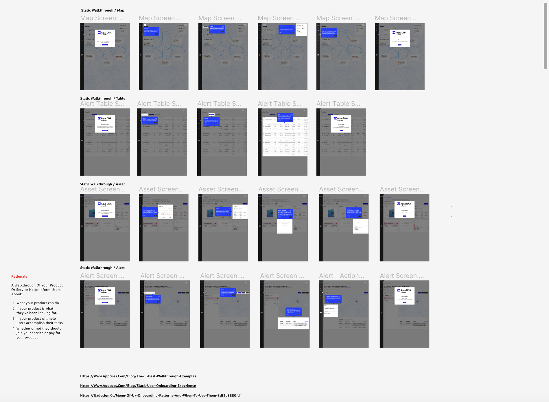
Prototypes for each screen were provided to all Aqua DNA users before the launch of the first redesigned version, accompanied by a document explaining the new features added to the platform.
In this manner, users could simultaneously read the document and explore the new features while interacting with the walkthrough prototypes for specific screens.
All Aqua DNA users had access to the prototypes through an openly shared Figma file.