Job Applications Tracker

UX Challenge
I was given a take home UX challenge as part of the interview process. I decided to add this project to my portfolio because I would like to show my research findings as well as a prototype that I designed for this project.
Duration
One Week
Role
UX/UI Designer
Deliverables
Interviews
User Journeys
Persona
Sketches
Wireframes
Mockups
Prototype
Usability Testing
Tools
Figma
Miro
Maze
Challenge Statement
Enable job seekers to track and manage their applications and interviews in one place.
Problem Statement:
(Company name) turns applications into conversations by enabling direct communication between the job seeker and hiring managers. Everything happens within a simple messaging tool. Job seekers can message hiring managers about job opportunities, share their profile, book phone calls, video calls and onsite interviews all within a messaging interface.
As job seekers start scheduling interviews with multiple companies, it becomes harder and harder to manage their calendar schedules and interview stages with all the different companies they're in contact with.
It's also very common that job seekers will be using other tools to find work in parallel with (Company name), which can make it even harder for them to manage as events may occur in multiple platforms. Interviewing for a job is commonly a very stressful process, managing all the interviews shouldn't add to that stress.
- How do you design a tool that enables job seekers to manage all their interview stages and applications with different companies in one place?
- What is the context of use of this tool? What other tools support the user's goals and what are the technical environments and constraints? Are there any contextual factors that will affect the user experience?
- Who are your users and what are their main goals, characteristics and pain points? What methodologies would you use to create a better understanding of your users and the context of use?
- What form of testing is most appropriate to assess the usefulness, usability and ease of use of this tool?
- As a designer, what can you do to minimize extraneous cognitive load when using the tool?
Challenge deliverables:
- UX research plan (research and testing methodologies)
- Hi-fi prototypes & documentation of the tool and design decisions (prototype could be either static or interactive)
Extra optional deliverables (Bonus):
- Any artefacts/materials generated to guide design and decision-making (i.e. user personas, sketches, wireframes, flow diagrams, etc.)
- Short report covering in more detail the questions above (1 page)
Assessment criteria:
- How comprehensive is your research plan? (50 points) (i.e. Will the chosen research methodology be the most appropriate for you to uncover all of the user needs and pain points? How have you planned to analyse the context of use? Will the chosen testing methodology be the most appropriate for assessing the tool's usefulness, usability and ease of use?)
- Are the prototypes produced showcasing the key functionalities of the tool that will enable the users to accomplish their main goals? Are they consistent/compliant with key usability guidelines and best practices of UX design? Are the design decisions taken during the process clearly documented and justified? (50 points)
- Have you produced any other material to help guide your UX research and design work? (+5 points)
- Are all the questions been addressed and covered in the designs or the report? (+5 points)
What's The Goal?
To design a tool that enables job seekers to manage all their interview stages and applications with different companies in one place.
Research
View Mind Map
Interviews
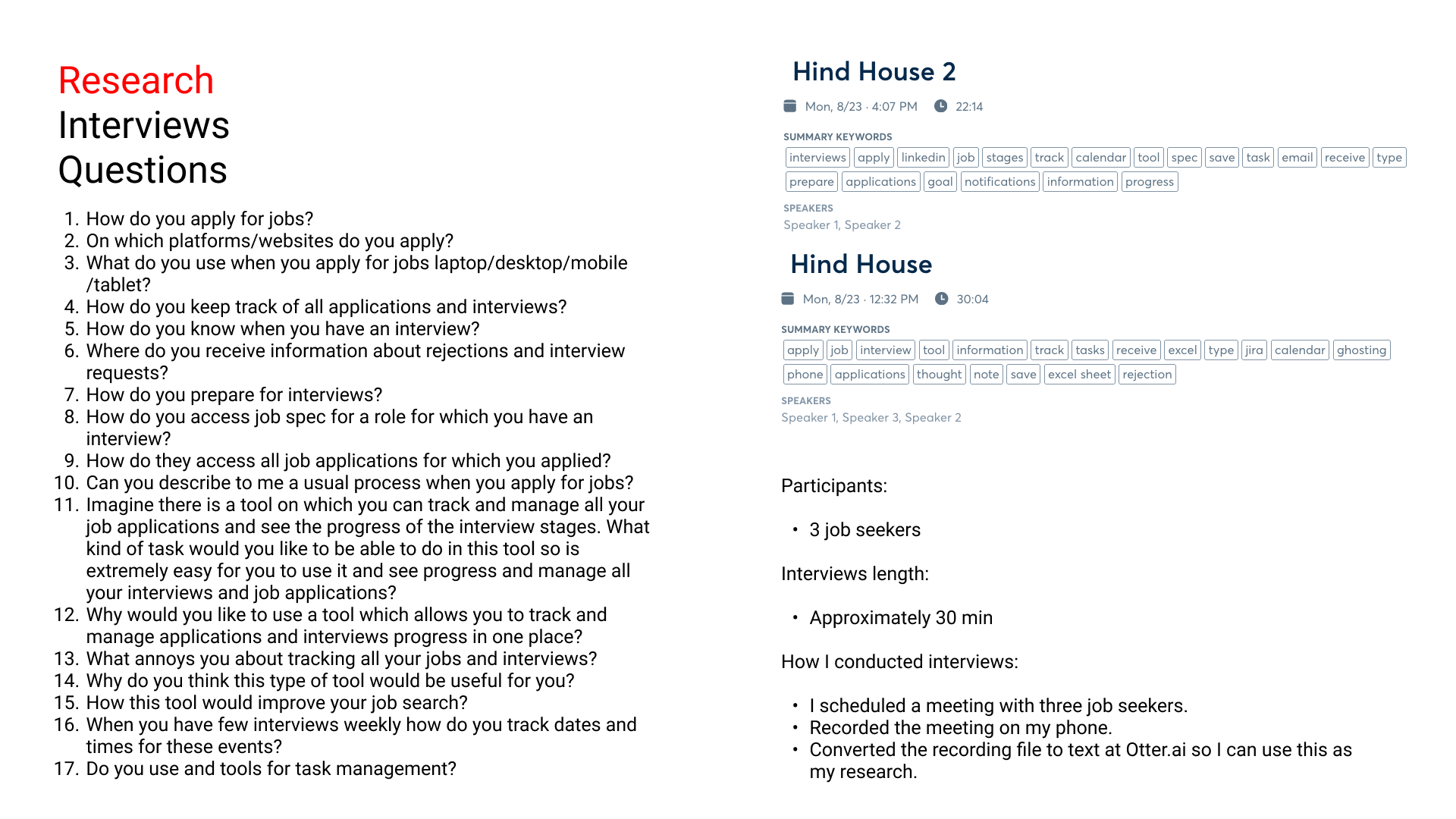
Job Seekers Quotes:
“Yeah, maybe go into indeed. And then click a button, then it says safe to this tool which tracks all applications. Yeah, it should just like automatically an automatic input would be so good”
“It would be nice to have the list of jobs you apply for. I'm probably listed by the company name. And then like if you're able to click on them and see the details, plus whether they've responded or seen your application. To message to and from whoever's recruiting for the job is the best thing. Just total transparency between the employer and the applicant would be best because I think it's too easy for employers to just ignore applicants.”
“We we browse jobs on our phones. And if we see one we're interested in go, we use our laptop to apply.”
“I also saved them because I when I was applying for jobs, previously, we made that an Excel sheet. And just note down all the jobs I want to apply for, and then do that all at once. And then take note of which ones I've applied for which ones have responded and which ones were asked for an interview.”
“I'm simply saying, because I have my interview notes in one thing, would be good to be able to put in there as well.”
“I think sometimes job interview invitation doesn't go on my calendar. Sometimes it does, doesn't then I put it on my phone.”
“I think, um, rejections are really, really poorly done on time, though, I think rejections by email are usually just sent by the recruiter or by the, by the HR or something, and it's just really not helpful at all. Because it would just be like, sorry, you won't be hiring you, you know, doesn't give me any helpful information. Even if it's just something short, one or two sentences that can help help you improve, it will be just so much better than these generalized responses.”
Persona

User Journey

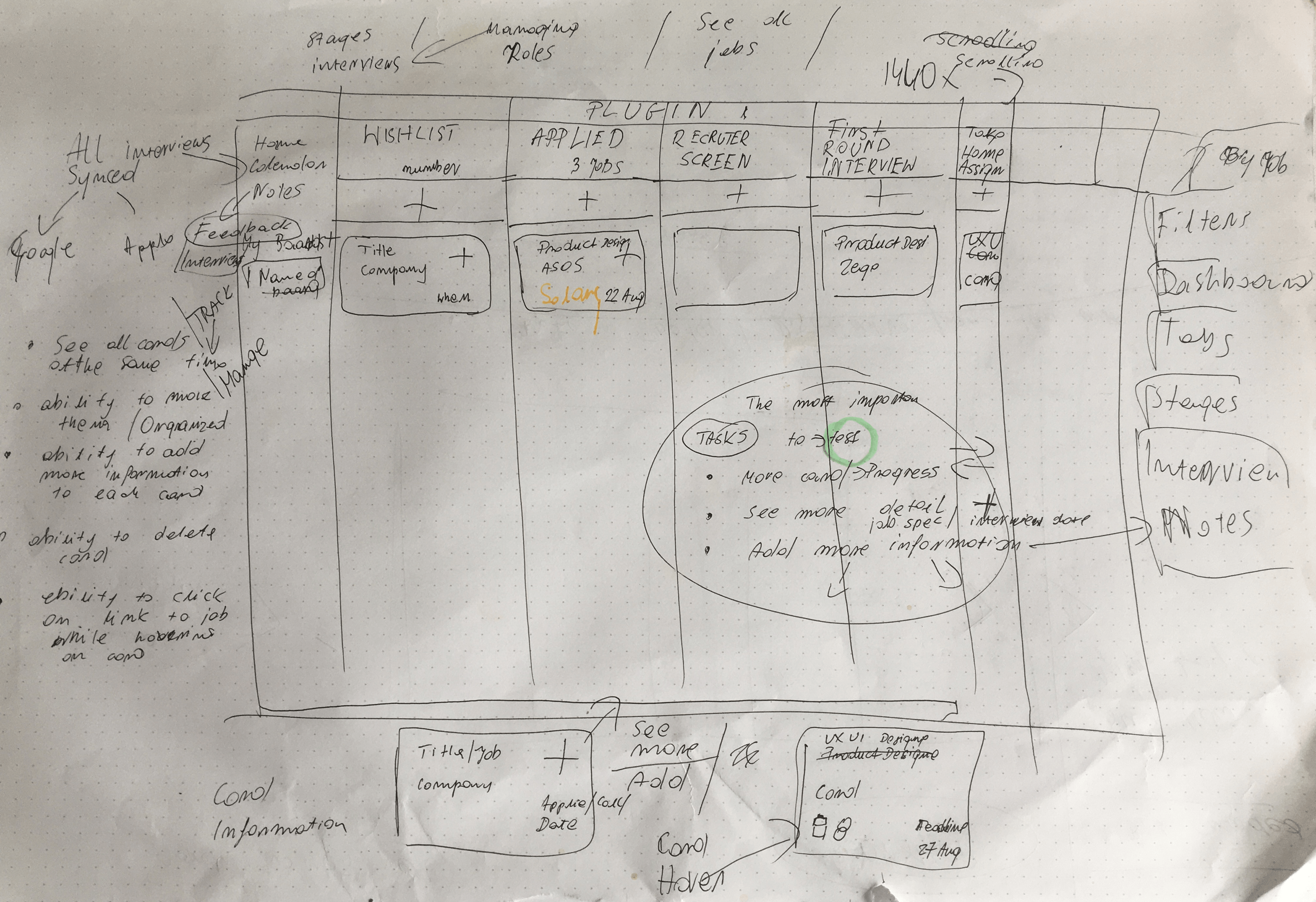
- What I wanted was to avoid making users input a lot of information in the tool. For this reason, I was thinking about a journey where users will use a plugin that will automatically save their job application in the tool while they are applying.

-
To track job invites I was thinking about a solution where users sync calendar or email with a tool this information will save automatically in tool. I think is a complicated solution to implement but from carrying out interviews, I know that the biggest pain point for users was a manual input of applications to excel or interview times and dates to calendars. It was just an extra effort for them to undertake on top of applying for the jobs.
-
What I wanted to achieve is to minimalise an effort to add information to tool and focus on tracking stages and managing applications.
Solution


-
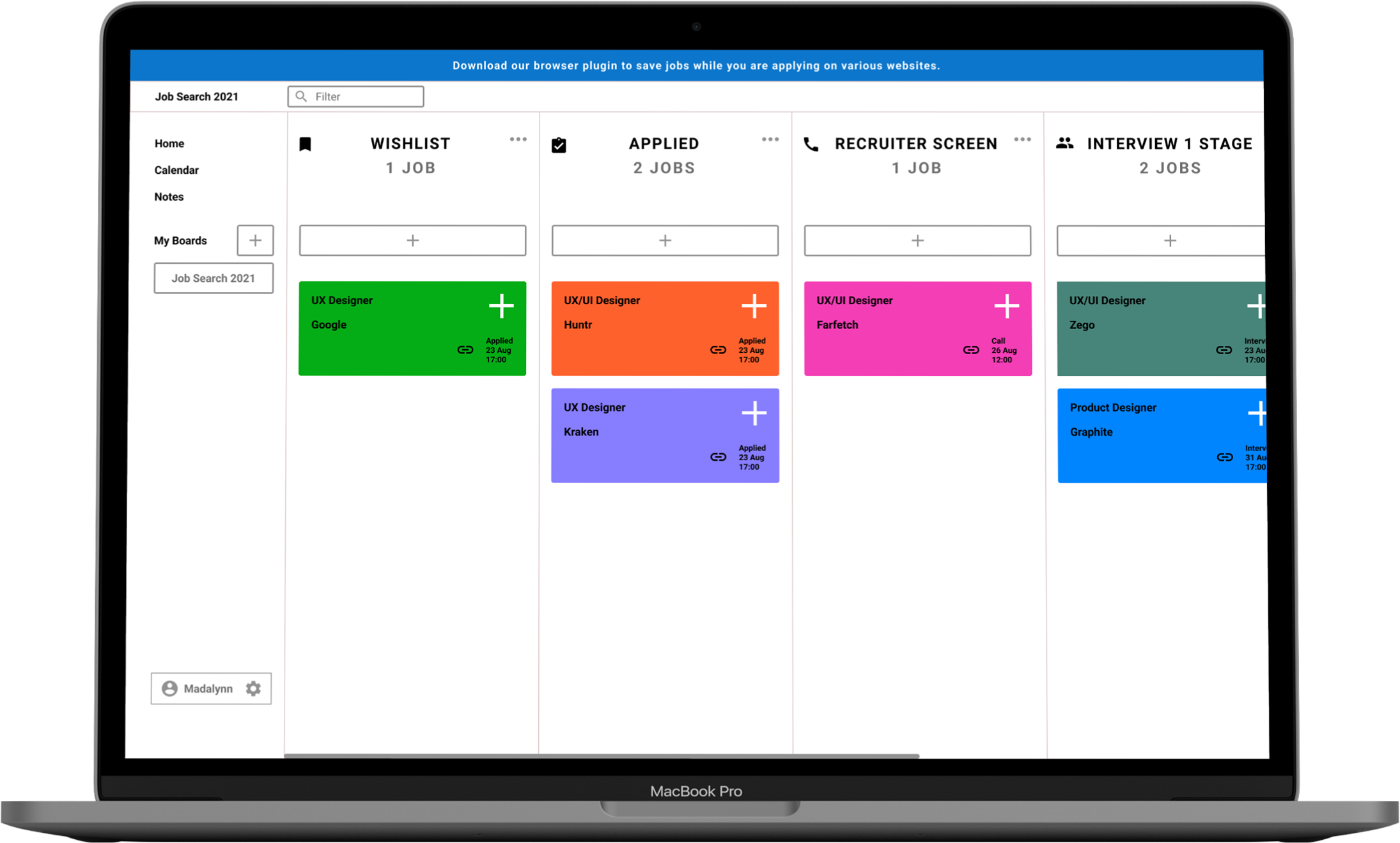
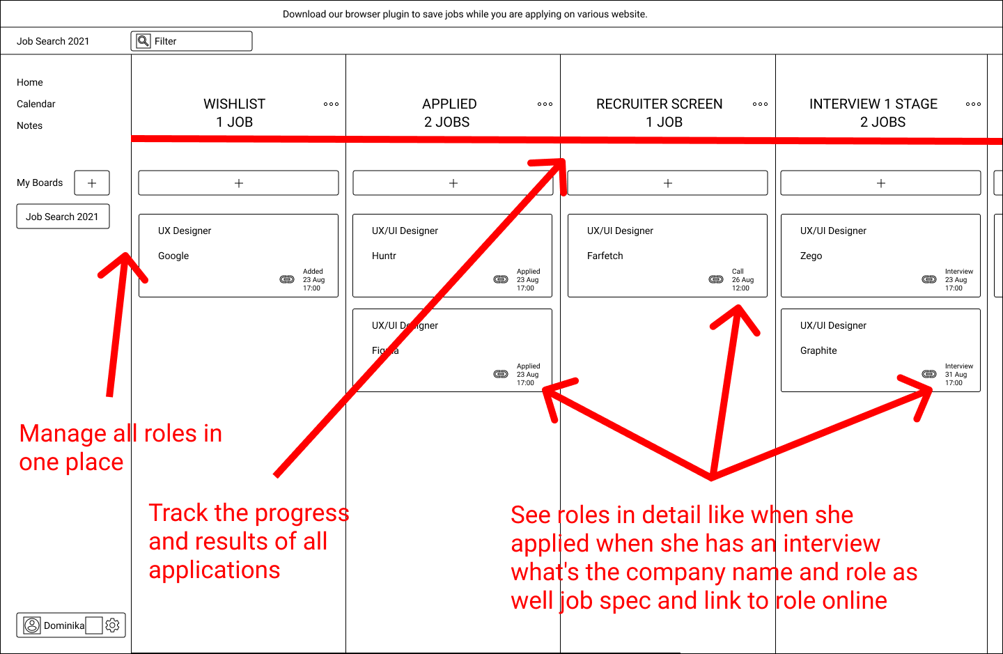
I designed the tool so that job seekers can track and manage their applications and interviews in one place. I decided to use a board because it's easier to manage all roles in one place, as well scan a lot of applications at the same time.
- User can move cards to another stage and see on a card when they applied when they have an interview or when they have a call with a recruiter.
- Users can click on a link to a job post, this will direct them to the website where they applied. Furthermore, the user can click on the card and see job specifications well as add notes and other information.
- My solution is influenced by research, mainly interviews with jobs seekers, as well competitive analysis.


Usability Testing
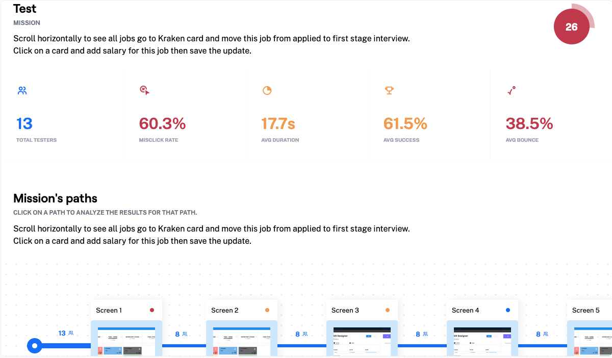
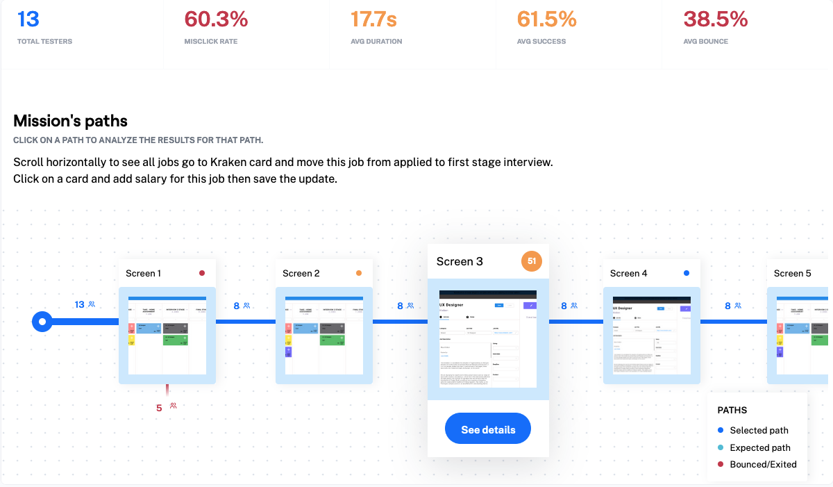
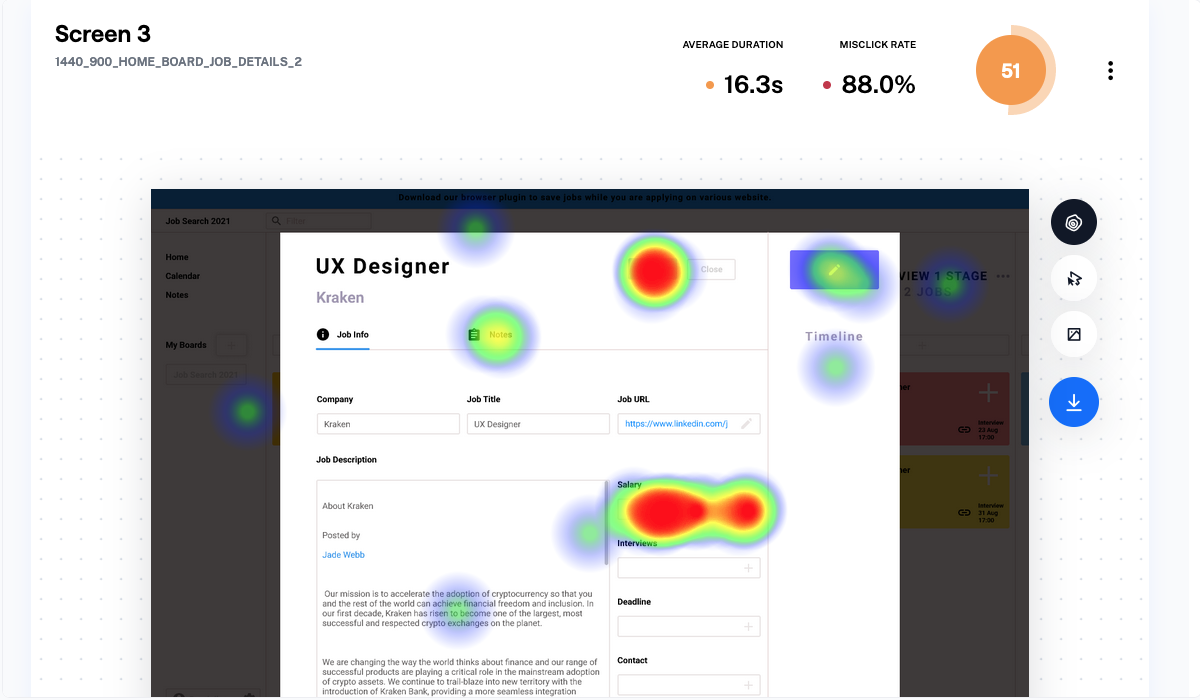
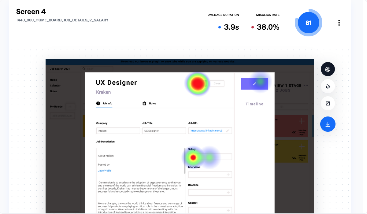
I decided to do usability testing with the prototype of the tool I designed. I aimed to gain data and find out the tool's usefulness, usability and ease of use. I also wanted to understand with which parts of the design testers struggled with the most when accomplishing a task that stated:
Scroll horizontally to see all jobs go to Kraken card and move this job from applied to first stage interview. Click on a card and add salary for this job then save the update.
Participants:
13 testers
How I conducted usability testing:
- I uploaded the Figma prototype to Maze.
- I recruited people from my peers and posted a link to the prototype on Reddit with a request for help so I can get more testers and data from the usability testing.
- I specifically pointed out not to test this prototype on the phone.
- I spoke with some of my peers afterwards to test to understand where they struggled the most.
- Created a usability test document.


![]()
![]()
![]()
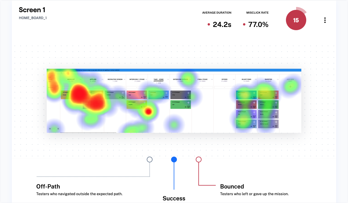
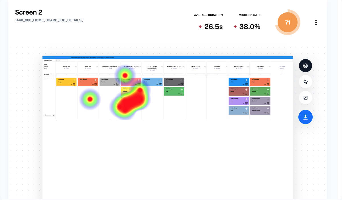
Key findings from a usability testing:
Problem ---> Testers struggled to scroll horizontally to see the whole board
- When I was testing my prototype in Figma, I tested the prototype with a magic mouse. The issue was with the normal mouse. When users were testing the prototype with the normal a mouse they were unable to scroll like with a magic mouse and they didn't click and drag on to the board to see the rest of the board, since I said to scroll horizontally.
Tester Quotes:
“I think it wasn't clear that I needed to scroll right and there should be a bar to drag to scroll horizontally because I could only use the touchpad. Then for some reason, I couldn't scroll down either. I had to then click enter to save, did I miss a save button? The scrolling didn't work for him either.”
Problem ---> Scroll bar not working on a prototype
- I didn't know how to prototype this interaction in Figma and I knew that users should be able to use it in the tool to see the rest of the board. Users told me that the scroll bar didn't work when they tried to use it.
Tester Quotes:
“There wasn't a bar to drag right if you don't have a trackpad.”
Problem ---> Input field for salary is not following widely used pattern for people to input information
- I should allow users to click on the whole field not on a plus icon first to add salary. The solution generated a large number of misclicks because users are not used to this way of adding information in fields.
Takeaways
- This project taught me about the importance of interaction. Data from usability testing clearly shows how usability from screen 1 dropped because I didn't test my prototype on both mouses as well on the laptop.
- The Magic Mouse allows users to scroll horizontally with a move of a finger. When users were using a normal mouse they were unable to scroll like that and they could only click and drag to see the whole board.
- This experience showed me that when I design a digital product, I need to dive more into how users will interact with this product and which devices they will use to interact with this product.
Further Improvements
- After presenting the design challenge prototype in the last stage interview to the hiring team, I continued to improve the UI with a focus on accessibility. Specifically, I made significant improvements to the colour contrast of all components to ensure compliance with accessibility guidelines.
- I created a UI kit that includes a typography scale, grids, and various components all designed with auto layout.

