Graphs Redesign for Aqua DNA at Jacobs


Graphs Redesign
Product : Aqua DNA at Jacobs
As part of Aqua DNA redesign team, I led the redesign of the graph page for Aqua DNA at Jacobs, a page many users rely on to understand assets performance.
Based on feedback from Aqua DNA users, I did the research, analyzed the findings, and then designed new screens and prototypes.
My designs made the graphs and their interactions simpler and more user-friendly. The proposed solutions were all based on user research and business requirements.
Project Duration
- 3 Months
Role
- UX/UI Designer
Deliverables
- Script
- Conducted interviews with 3 Aqua DNA users
- User journey analysis
- UI Screens
- Interactive Prototypes
- Design Specifications
Tools
-
Figma (Design and Prototyping)
- Teams (Interviews)
Stakeholders
- Myself (Project Owner)
- UX Lead
- Business Analyst (BA)
- Developers
Problem Statement:
Users find it difficult to know which graph to create to best investigate the alert / event.
Users find the graphs confusing to read and interpret the information correctly.
Simple guidance on how to generate and read the graphs.
Some users aren't familiar with PS etc. so needs to be untechnical.
What's The Goal?
As a standard user (all roles)
I want
- No ambiguity about which graph I should generate for each alert / event type.
- The graph and data to be relevant to my alert investigation.
- So that the graph user journey is improved and I get all the value out of the data that is being displayed to aid in my investigation.
Acceptance Criteria
Platform clearly indicates the best type of graph to create for the alert / event.
Detail on what the graph is showing that relates to the alert / event.
Clearly indicate on the graph the time period that relates the the alert / event (e.g. could automatically zoom in).
Graph is clear (not overwhelmed with data points) so I can see the anomaly / problem that has triggered the alert / even.
Can adjust the units and scales on the graph.
Graph is clearly labelled with easy to understand terminology.
Research / Interviews
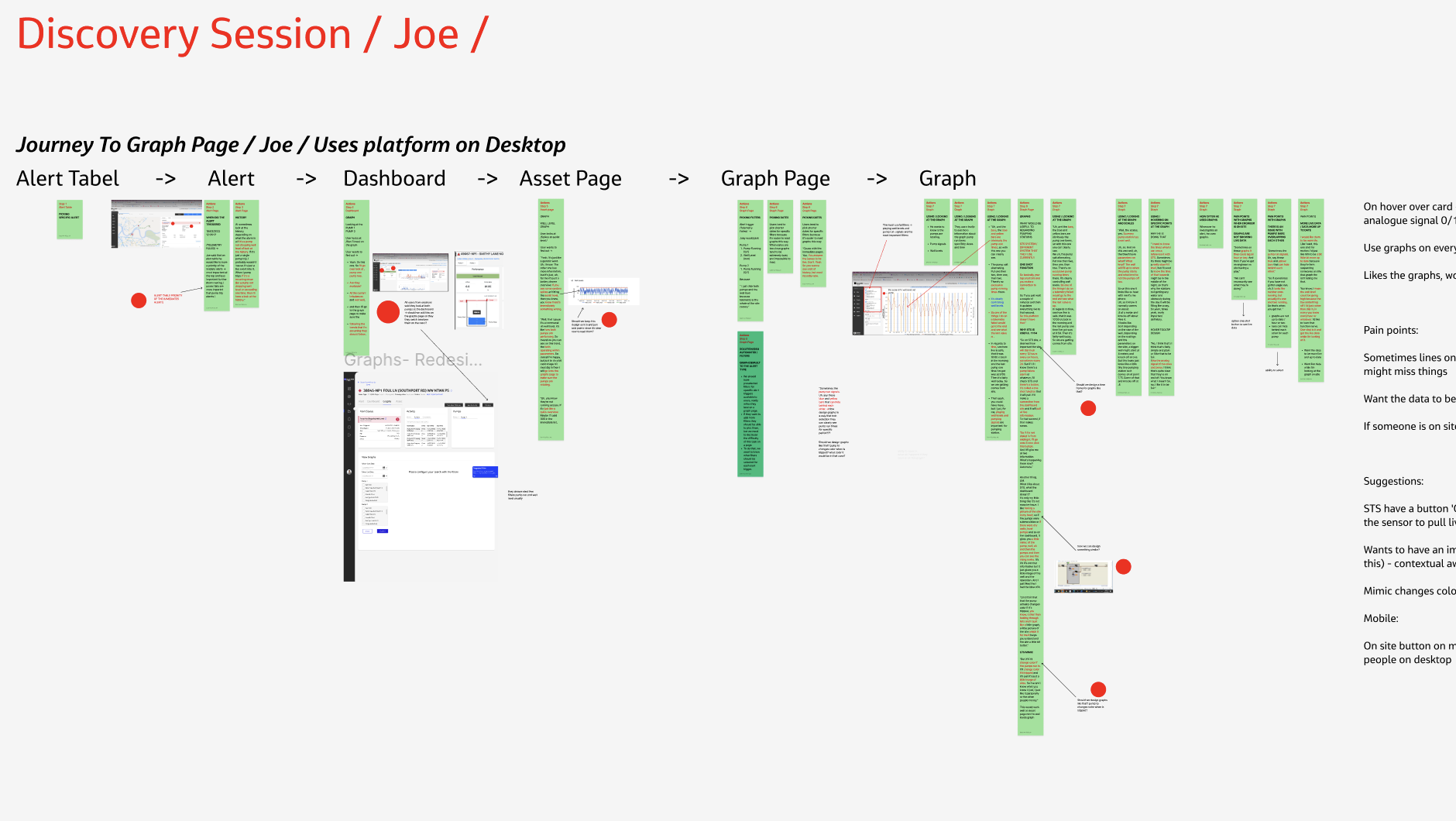
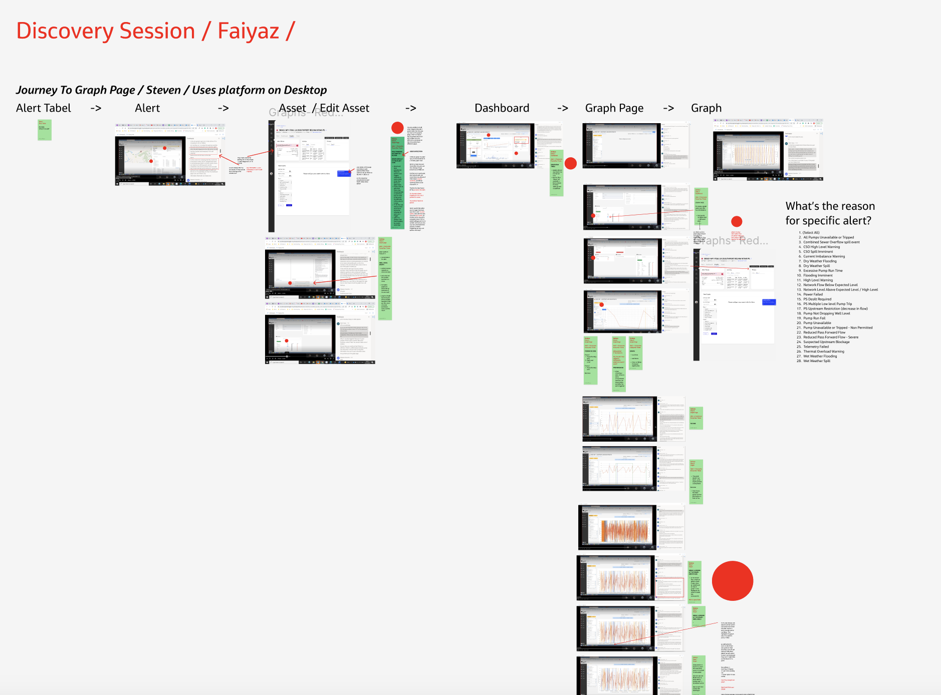
I conducted three discovery interviews with actual Aqua DNA users
Example of script written for discovery sessions with users
At the beginning I would like to find out how you navigate to the graph page
- What is your usual journey to the graph page? On what page do you start when you navigate to the graph page?
- Can you pick a specific alert and show us how you would get to the graph page? Work as you would normally, narrating your thoughts as you go along.
User is on the alert / dashboard page
- Where do you look now and why?
- What information do you want to gain from this page? That will be useful for creating a graph.
Graph Page
- What alert/event are you investigating now? What triggered this alert? User is on a graph page.
- What dates should you pick from a date picker to investigate this alert / event on a graph? And what would be the reason for this?
- What filters should you pick to investigate this alert/event on a graph?
- Walk me through the filters and describe to us what they mean to you.
- What information on the graph page does not make sense to you and why?
- On what kind of device do you perform your job when you use (product name)?
Graph / Chart
- Walk us through the scales on the graph and think out loud explaining what they mean to you and what would you expect to see knowing that you are investigating a specific alert now? Remind me of what triggered the alert?
- How do you understand the labels at the bottom of the graph?
- What is clear when you look at the graph?
- What is not clear when you look at the graph?
- Can you interpret a graph from an alert / event point of view? Explain to us what information you can get just from looking at the graph now?
- Explain to us in what way graph doesn’t help you to investigate alert fully.
- What functionality would you add to the graph to make it easier for you to read?
- Looking at the graph now what information do you want to find out? What’s the key information you want to find out?
- How often do you use graphs when you perform your job?
- In what way would a better ability to analyze graphs would make your job easier to perform?
- What annoys you the most while using/creating graphs on the platform?
Research / Analysis

Key research findings / Pain points:
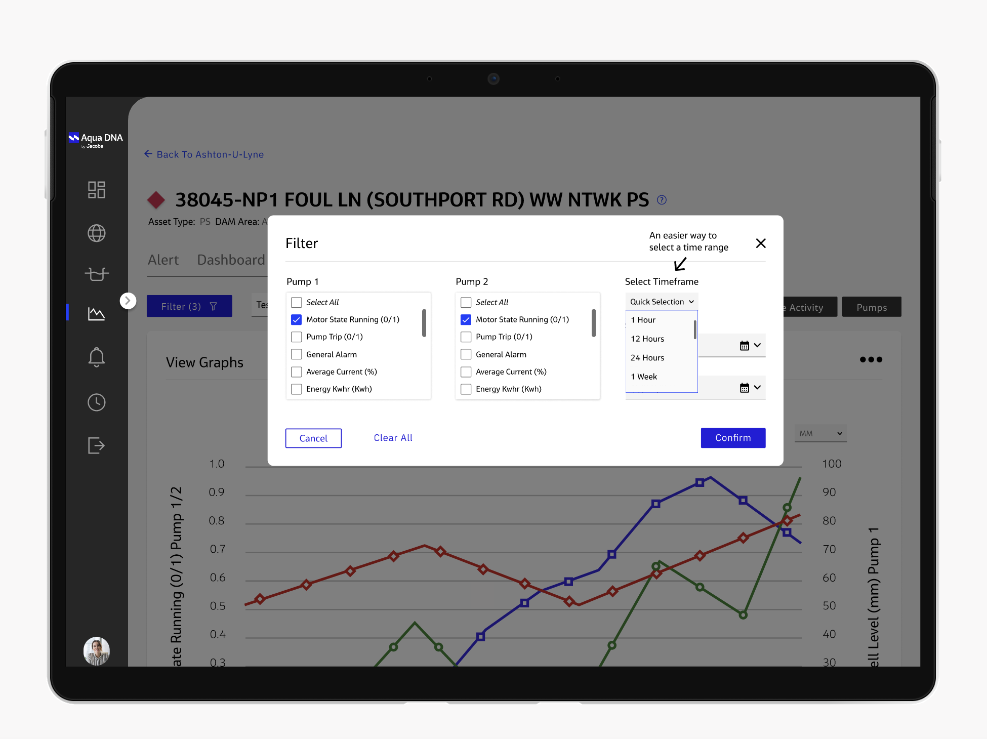
Date selection
- Users wanted a simpler way to change the timeframe, rather than toggling back and forth with a date picker all the time to be able to change timeframe.
- They frequently accessed timeframes of one hour, 12 hours, one day, one week, one month, three months and six months.
- In response to this feedback, we introduced a quick selection dropdown, enabling users to effortlessly choose a specific timeframe without navigating through a calendar.
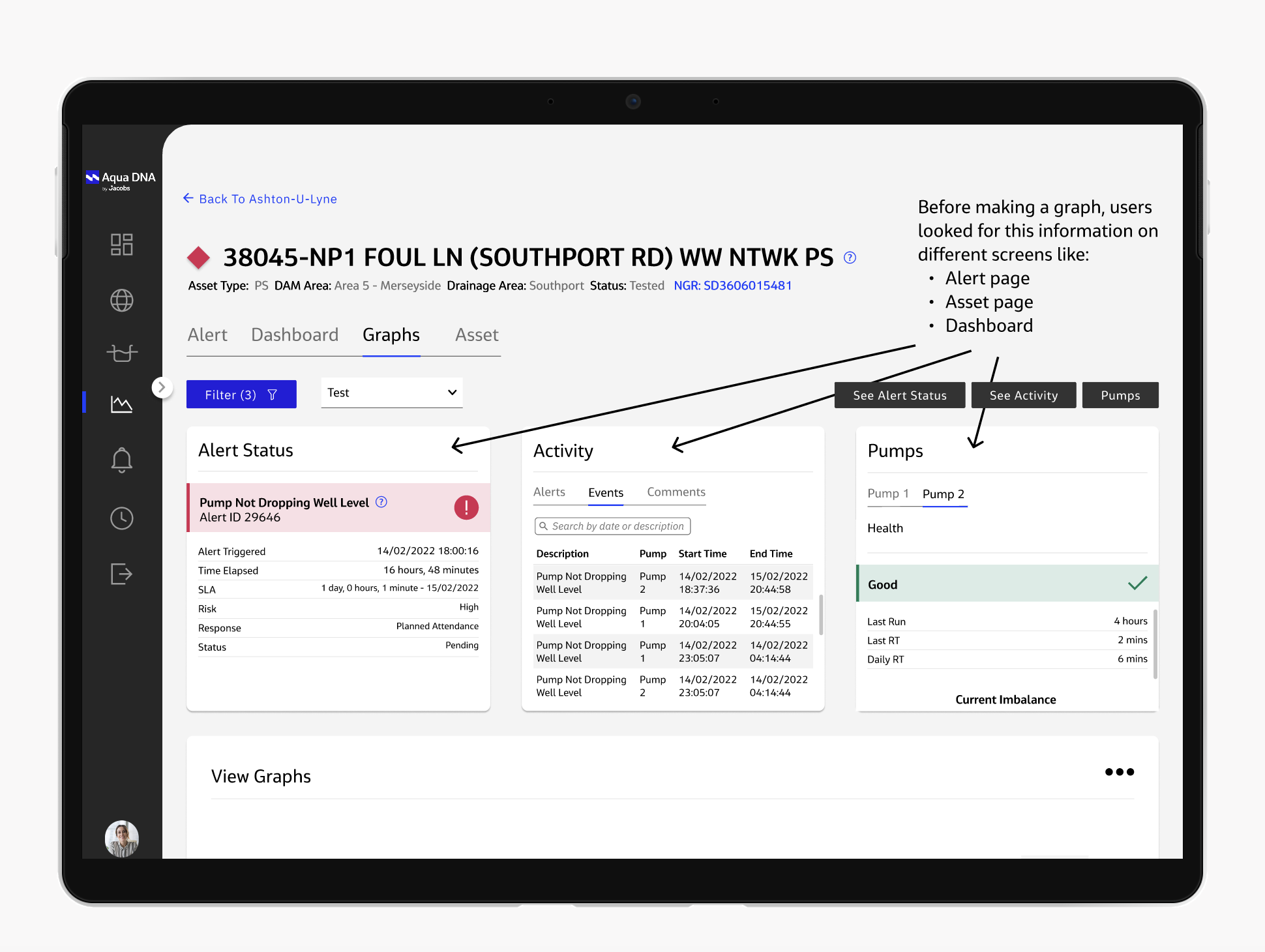
Information retention
- To investigate asset performance for each alert or event, users previously had to open multiple tabs to compare data from various pages. They would frequently toggle between pages, trying to remember information from one page while creating a graph on another.
- During the sessions, it became evident that this task was challenging for users, as they couldn't recall all the necessary information to construct an appropriate graph.
- The solution to this problem was to introduce three cards displaying the most crucial information needed to create a specific graph for each alert or event.
- During the discovery sessions, I asked users specifically where they look before accessing the graph page and what essential information they need to create a graph for investigating an alert or event.
- This helped me understand a typical user journey and identify the components we should add to the graph page.
![]()
Filter selection
- Users had difficulty choosing the appropriate filters to analyze the alert / event.
- We decided to include two pre-selected filters for each asset, ensuring they're always relevant for all asset investigations.
- This reduced the cognitive load for users. Instead of wondering what to select, the primary filters were already chosen, and users could refine them in more detail later on.
